WHAT IF I TOLD YOU THAT THERE IS NO SUCH THING AS "SKIN UNDERTONE" ?
published on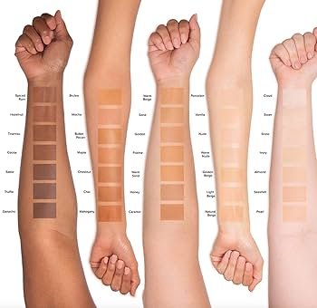
What if I told you that, as I approach my 20th year in colour consultancy, I’ve concluded that "skin undertone" simply doesn’t exist? Shocking, right? What if I choose to exercise my right to revise every article I’ve written and every sentence I’ve uttered on this subject until now?
The penny dropped in mid-2025. Of course, since I took a short break from blogging, I’m only just able to share this discovery regarding our terminology and phrasing.
But don't worry! If you’ve already had a colour analysis, there’s nothing here that will change your colour group or undermine the essence of the insights I’ve shared that you’ve come to trust.
1) The Core Indicator
The most important marker of a colour analysis result is whether the colours that make us look good have warm or cool undertones. We aim for these undertones in our palette specifically to prevent unwanted reflections on our skin.
2) The Saturation Breakdown
Next comes the question of saturation: is it low, medium, or high? When measuring saturation, our goal is to find a range on the "muted-to-vibrant" axis that matches the light reflected by our skin.
3) The Four Main Groups
The combinations of these two measurements give us the four main color groups:
Warm Undertone + Sharp (Clear)
Warm Undertone + Soft (Muted)
Cool Undertone + Sharp (Clear)
Cool Undertone + Soft (Muted)
If we are performing colour analysis using a method with solid foundations, we want the flattering colours to "speak the same language" as your skin. But what does that mean exactly? It’s about more than just looking stylish; when the right colour tone and your skin dance with light in the same way, it creates an "elixir of life" effect—a healthy, vigorous glow appears.
There are various schools of colour analysis worldwide. I belong to the school that begins this measurement with fabrics in warm and cool undertones. First, I eliminate those that create an unwanted effect on the skin. Then, I test for "sharpness"—the parameter that affects our perception—and eliminate colours that are too pale or too bright.
A reflection of a colour with the wrong temperature drags the facial features down, pinning a sad, sick, or exhausted expression onto us. We can silence all this "visual noise" by ensuring that what you wear reflects correctly off your skin.
The wrong saturation level, on the other hand, makes us look either "overwhelmed" by a color (which can be perceived negatively as trying too hard or being a fashion victim) or "faded" (appearing weak or inadequate). We silence this perceptual chaos by ensuring that your skin and your clothes reflect light in equal amounts.
So, what have I actually been doing for twenty years?
I don’t take skin samples and send pigment distributions to a lab. I don’t cut into skin, flip it over, and look through a magnifying glass to see what’s underneath. I don’t use imaging devices to see what colour blood is circulating in veins that are actually colourless. I don’t ask a physicist or a doctor to measure how deeply the light I hold against a client’s skin penetrates their body...
Despite all my years of experience, if I thought our skin differences were the result of pigment distribution or composition (ratios of melanin, hemoglobin, and carotene)—and if that’s what I read and shared back then—I now understand from my current reading that our differences actually stem from different versions of the melanin pigment.
Shame on me for holding such a stance against "rote knowledge" while falling for it myself! And if you are a dermatologist reading this, consider this a formal complaint for not warning me! Who knows what other "rote" facts I have about my profession and life that I haven’t questioned yet? Well, we live and learn...
(I would never bother measuring it when there’s a shortcut like color analysis!) Using a much simpler method—brace yourselves—I do what colour consultants all over the world do: I create a palette of warm undertoned colours for those who look good in warm undertoned fabrics, and cool undertoned colors for those who shine in cool under toned fabrics.
The mistake I’ve made until today was telling people, "Your skin has a warm undertone."
As it turns out, there is no such thing as a person's skin being "warm" or "cool" undertoned. There is only the skin's good or bad reaction to warm or cool nuanced colorus. It is the undertone of the flattering colours that is decisive, not the skin itself.
This confusion in colour analysis literature may well have been caused by the famous "foundation undertone" term from the cosmetics aisle being accidentally attributed to the person rather than the colour palette within the discipline of colour analysis.
Because the subtle nuances of light red, orange, yellow, and olive that we see under white, beige, or (if you are Black) brown concealers/foundations—what we call "foundation undertone"—are indeed an extension of your skin color. A sales consultant would be right to tell you that you have a skin color in the "undertone of your foundation beige."
Warmth: (Orangey white / beige / brown skin tone)
Coolness: (Light reddish white / beige / brown skin tone) – which may be perceived as pink.
Neutrality: (Yellowish or olive white / beige / brown skin tone)
I’ll share an experience I always enjoy citing: even twins with the exact same skin color can end up in different color groups.
In short:
The result of a colour analysis has nothing to do with our skin colour. What we colour consultants are chasing is something else entirely: The physical reaction of your skin to light!
To summarize: It is not your skin, it is not you—it is the "colours that make you look good" that have an undertone.