THE ERA OF BESPOKE COLOUR PALETTES IN TÜRKİYE
published on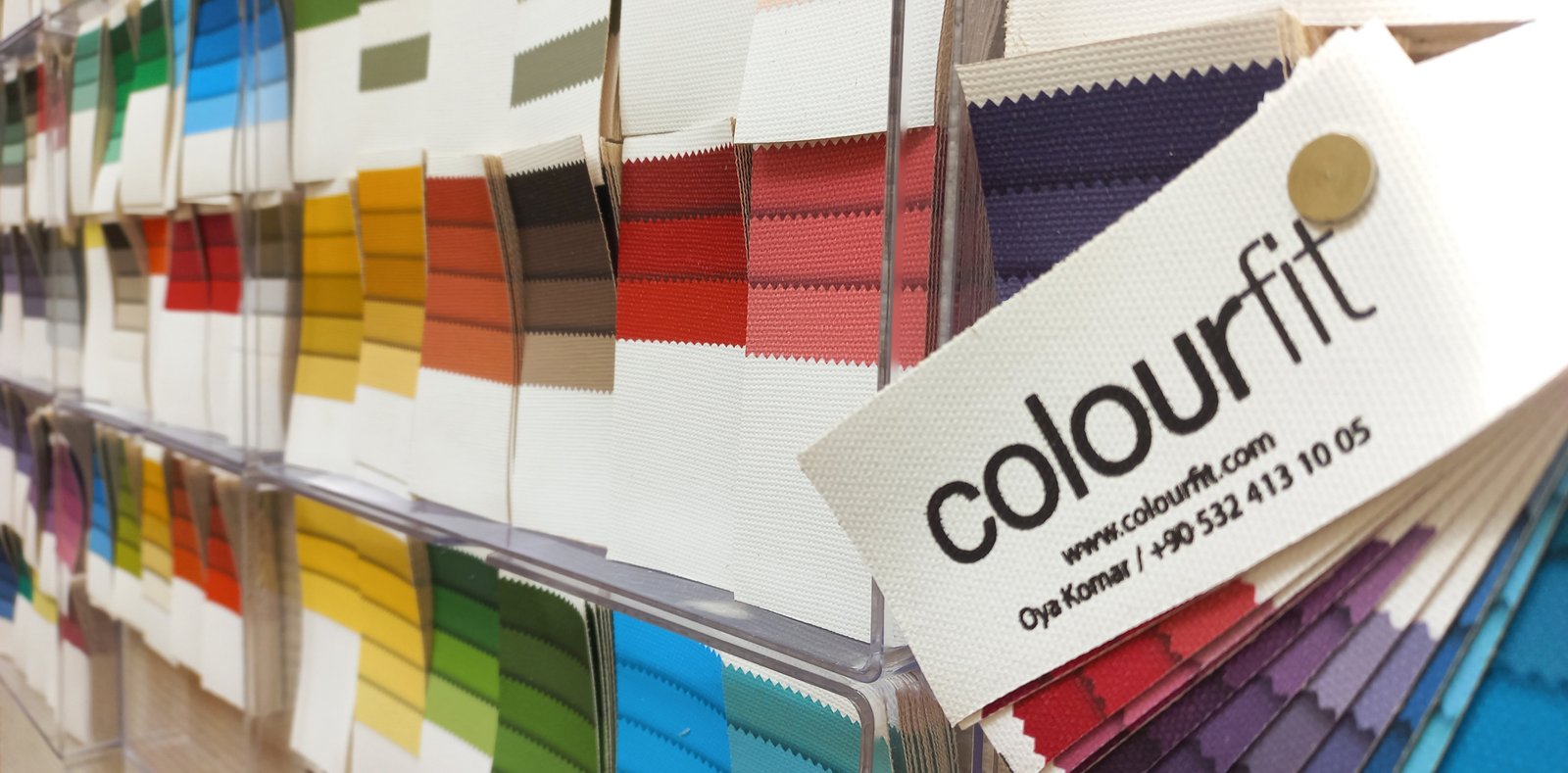
At the beginning of my career, I worked with the classic four main groups of seasonal colour analysis: Spring, Summer, Autumn, and Winter. This was what I had learned, and what I applied to my clients...
However, as my experience grew, I began to notice something: not every colour in the seasonal palette template I delivered at the end of a session suited my client to the same degree. I felt that this was not due to the palette being incorrect, but rather a depth of the system I had yet to discover. It was during that period that I was introduced to the more precise understanding that divides seasons into sub-groups.
The primary reason we divide seasons into three is that even if a person belongs to a certain season, there is—not always, but usually—a dominant characteristic among the colour properties that define that season. Thanks to this deepening, we can now say: "Yes, this is your colour group; but you should use these colours in your main pieces, these on smaller surfaces, and some only under evening light."
This approach highlights your "star colours" that are worth investing in. Ultimately, even if we share the same colour group with many people, these nuances in how we use colours are the clearest indicators of our uniqueness.
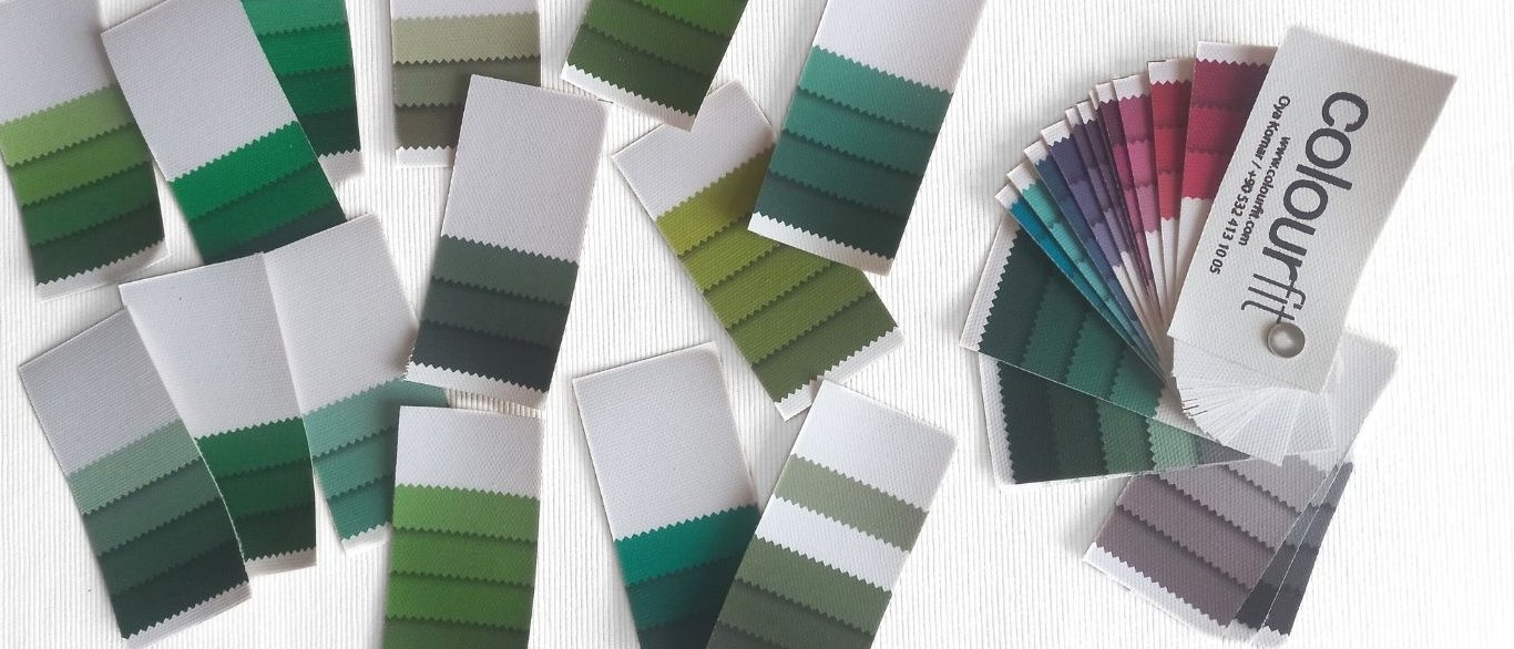
Although I have identified a few more sub-groups through experience, I have long been working with the "12-group" system, which is indisputably more accurate than the "4 seasons" during analysis. Naturally, I share with my clients the names of their respective seasonal sub-groups, which are recognised worldwide. Nevertheless, I found it more accurate to deliver a "4 seasons" template palette and to prioritise and mark certain colours within those seasonal palettes according to the client's sub-group.
If you ask why I didn't design palettes specific to the 12 sub-groups or why it didn't interest me, it is actually a "struggle" in practical terms. But it is a meaningful struggle that arises from the "effort to honour our uniqueness." To explain this, I first need to provide a brief overview.
Seasonal colour palettes are roughly based on the progression of tones across two main axes:
On the Temperature axis: From Cool → To Warm (e.g., from cherry red to terracotta)
On the Saturation axis: From Low → To High (e.g. mutedness to clarity)
The system divides both axes exactly in half to create the four main colour groups. Here, the boundaries are very clear, so there is no problem. However, in 12-group systems that attempt to divide each colour group into three, the boundaries become quite blurred.
In my session flow, I take it a step further by identifying the client's most dominant characteristic and placing them within that one-third segment of the season. But this is where the real challenge begins: while there are typical representatives of these sub-groups, some people's reaction to light embraces two sub-groups at once.
We usually encounter two situations with individuals located at the intersection of these two sub-groups:
Either those whose dominance in terms of colour qualities cannot be measured, and who can comfortably use all colours from both groups,
Or more interestingly; for instance, those who can carry their reds from one sub-group and their pinks from the other perfectly. (Women readers will guess just how important this becomes when choosing a lipstick shade).
At this point, I believe I have expressed the pointlessness of depriving a person of one of the sub-group palettes or confusing them by giving them two separate ones. What I mean to say is that, given the choice between sub-group palettes with fluid boundaries and "4 seasons" palettes with sharp frames, my preference is definitely the latter.
Because in the temperature and saturation parameters I mentioned, people never cluster at two opposite poles. We are so diverse! One of two people sharing the same season can be radiant in "very, very warm" tones, while another can remain at a "minimal warmth" that almost touches the cool side. From this point on, you can create 240 different sub-groups and palettes if you wish; you still risk missing those fine nuances.
Don't get me wrong; my intention is not to criticise the template palettes of the "4 seasons" or the "12-group system." On the contrary, as long as they are presented with the brief colour literacy, each of these systems is still very valuable. Because by taking the colours in these palettes as a reference, they make it easier to eliminate products that remain foreign to the person and conflict with them—essentially acting as a "filter."
But for me, the time has come to set these standard template palettes aside and talk about what is entirely "personal," offering my clients a much clearer, much more "bespoke" guide.
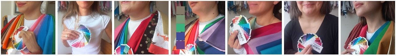
Reaching the right season at the end of our session is only the first stop on the journey. The real magic happens when we introduce dozens of colours within that season—from light to dark, with different saturations within seasonal boundaries—to your skin one by one. Watching every flicker of light on your complexion, we "hand-pick" only those that reflect you from that vast pool of colours.
Since the last quarter of 2025, we have the opportunity to curate your palette not via a static template, but instantly, based on your skin’s real-time reactions during the session. In this process, colours become a living guide that breathes with you and takes shape alongside you.
At the end of the day, the palette you hold in your hand naturally whispers the name of which of those 12 globally recognised sub-groups (or groups) you are closest to, but it doesn't stop there. While referencing that name from the literature, it incorporates only the intermediate tones that your skin approves of, turning that group into a completely unique signature for you.
This approach is a boutique study applied by a very limited number of specialists abroad, usually offered at astronomical prices due to its complexity and cost. Since my priority is not to make this above-standard experience "unreachable," but rather to touch more lives with the power of the right colour, I am presenting this process as a "transition period privilege," without yet making a change to my current terms, so we can share this excitement together.
This bespoke fan palette is not just a selection of colours; it is a "colour investment" I have prepared for you, beyond time and trends. If you wish to step outside the standards and discover your colours, you can visit the relevant pages on my websites for session details, duration, and pricing information.